Single Column Blog
The SingleColumnBlog component is designed to display a list of blog posts with an intuitive tabbed interface. It allows users to switch between different categories of blog posts such as Food, Trends, Guides, and Insights.
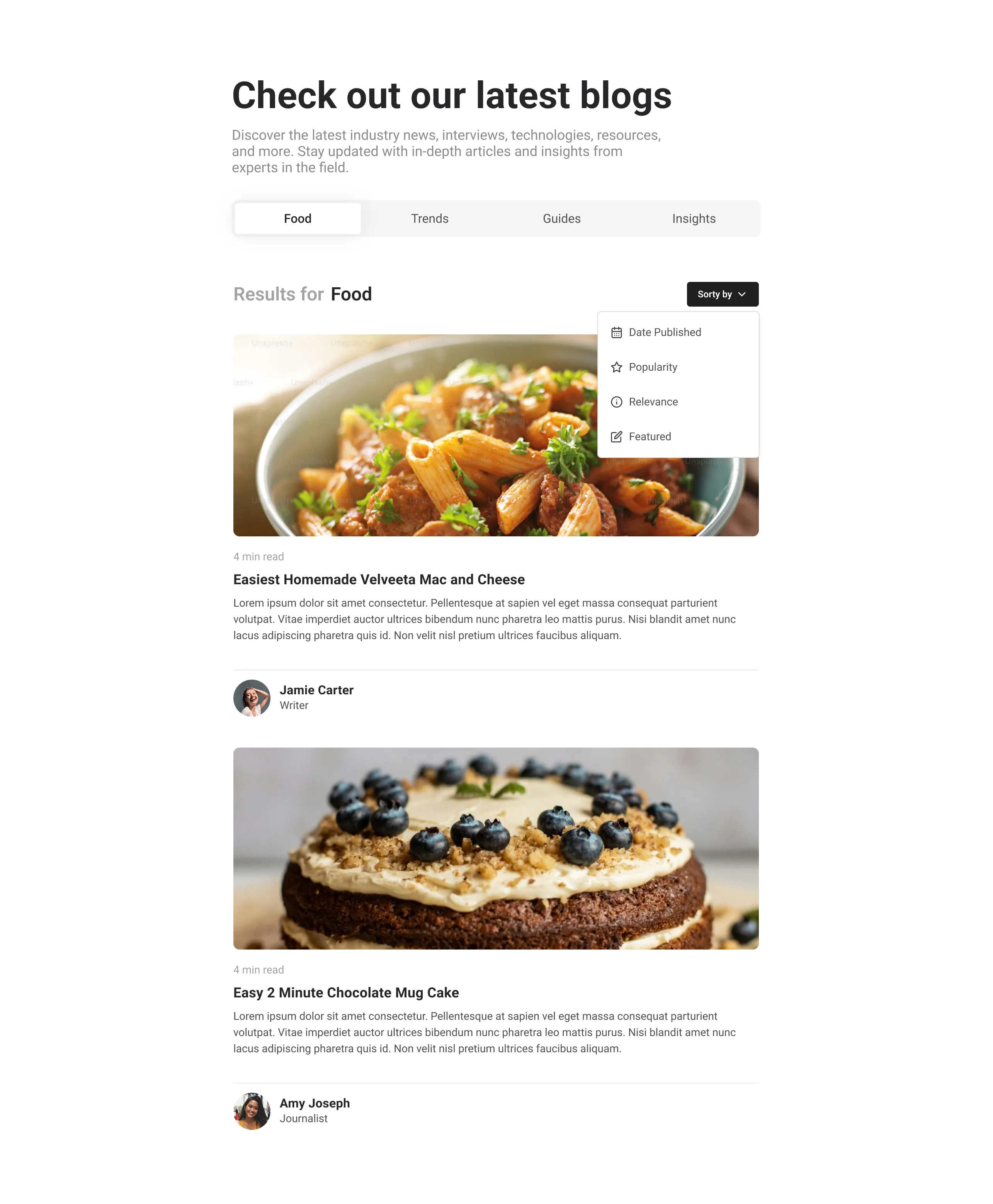
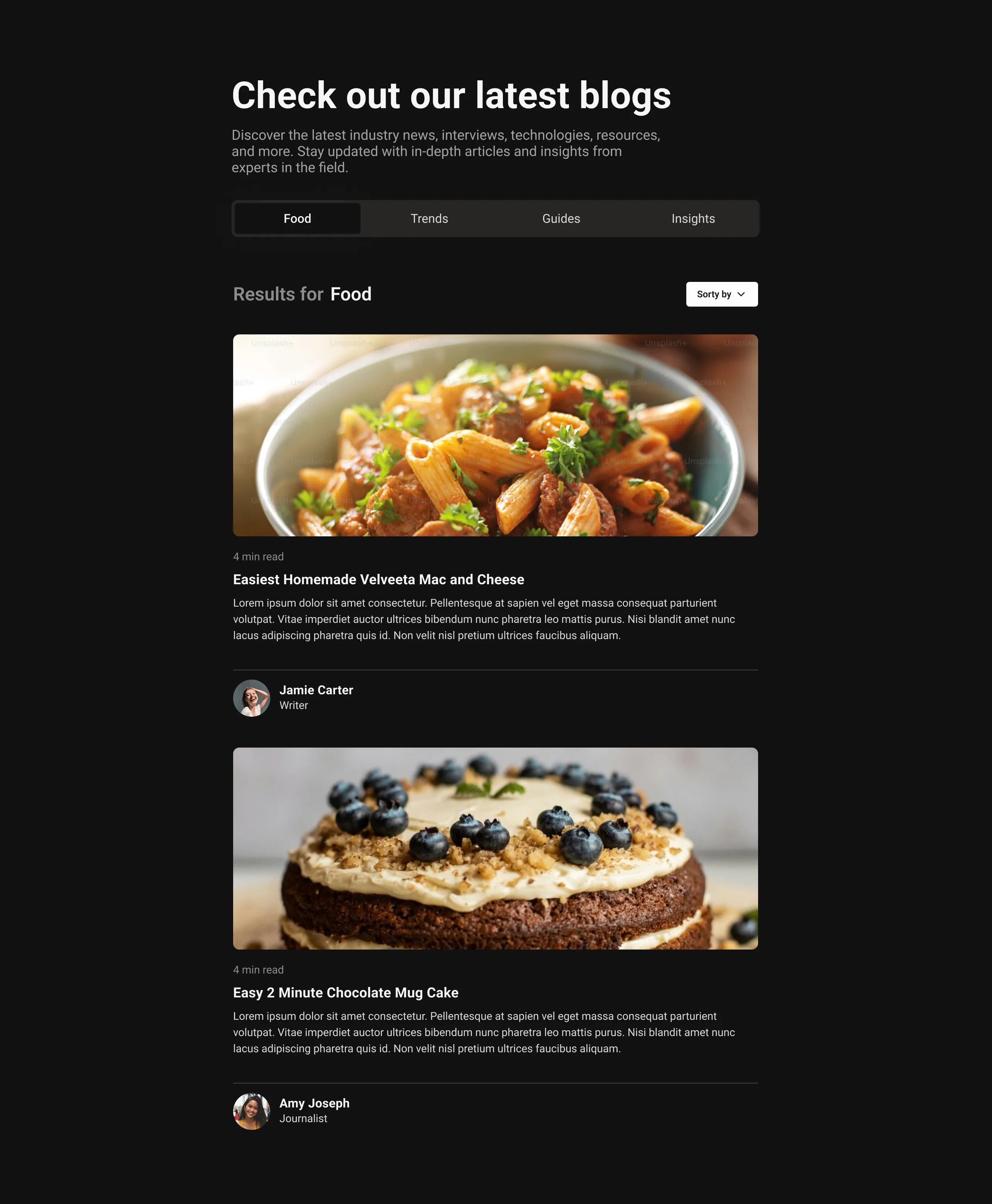
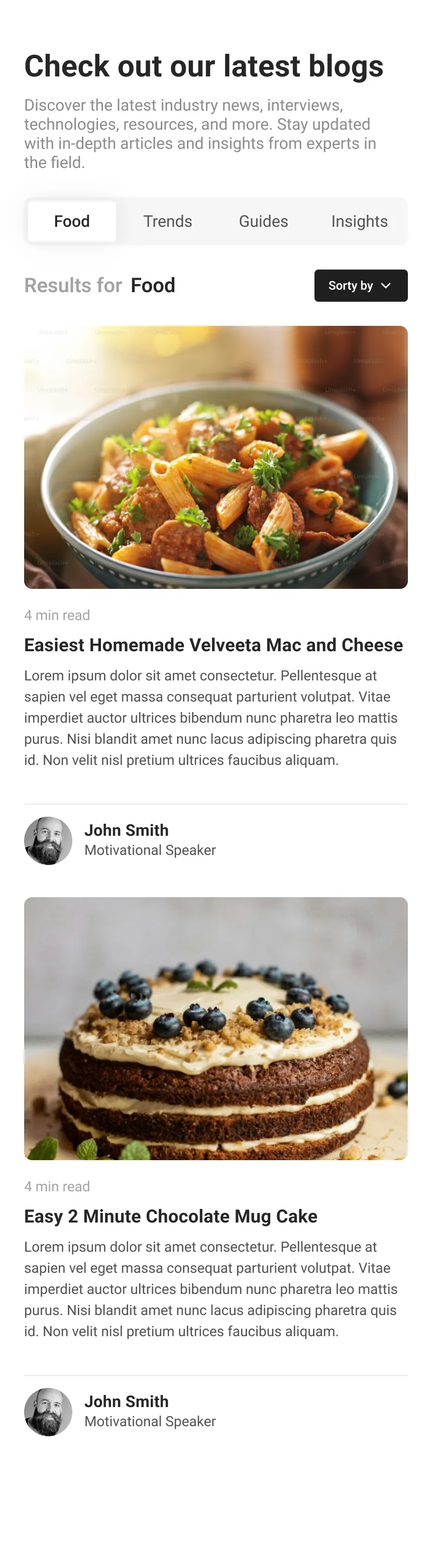
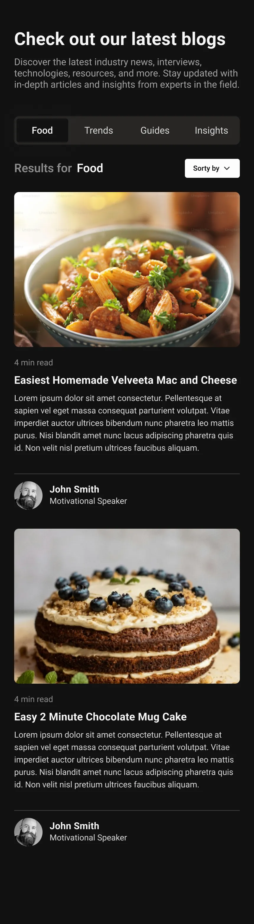
UI Preview
Usage
To use the SingleColumnBlog component, import it and provide it with the necessary data. Here is a basic example:
import React from "react";import { SingleColumnBlog } from "@app-launch-kit/components/custom/single-column-blog";import { foodData, trendsData, guidesData, insightsData } from "./data";
export const SingleColumnBlogBasic = () => {  return (    <SingleColumnBlog      foodData={foodData}      trendsData={trendsData}      guidesData={guidesData}      insightsData={insightsData}    />  );};