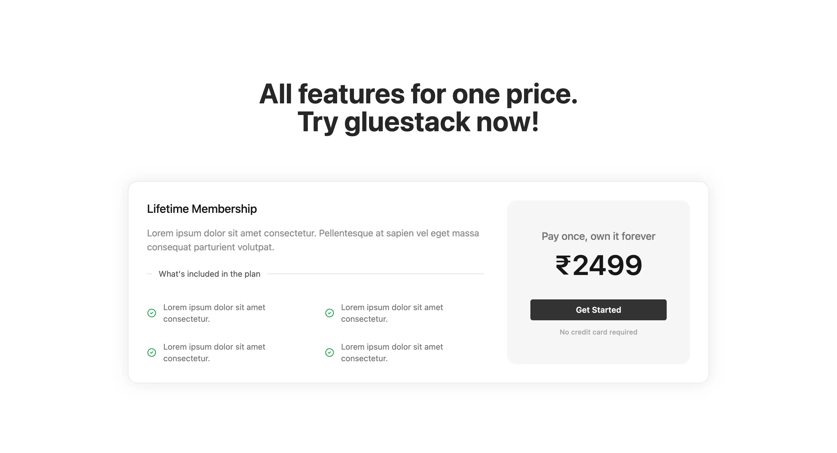
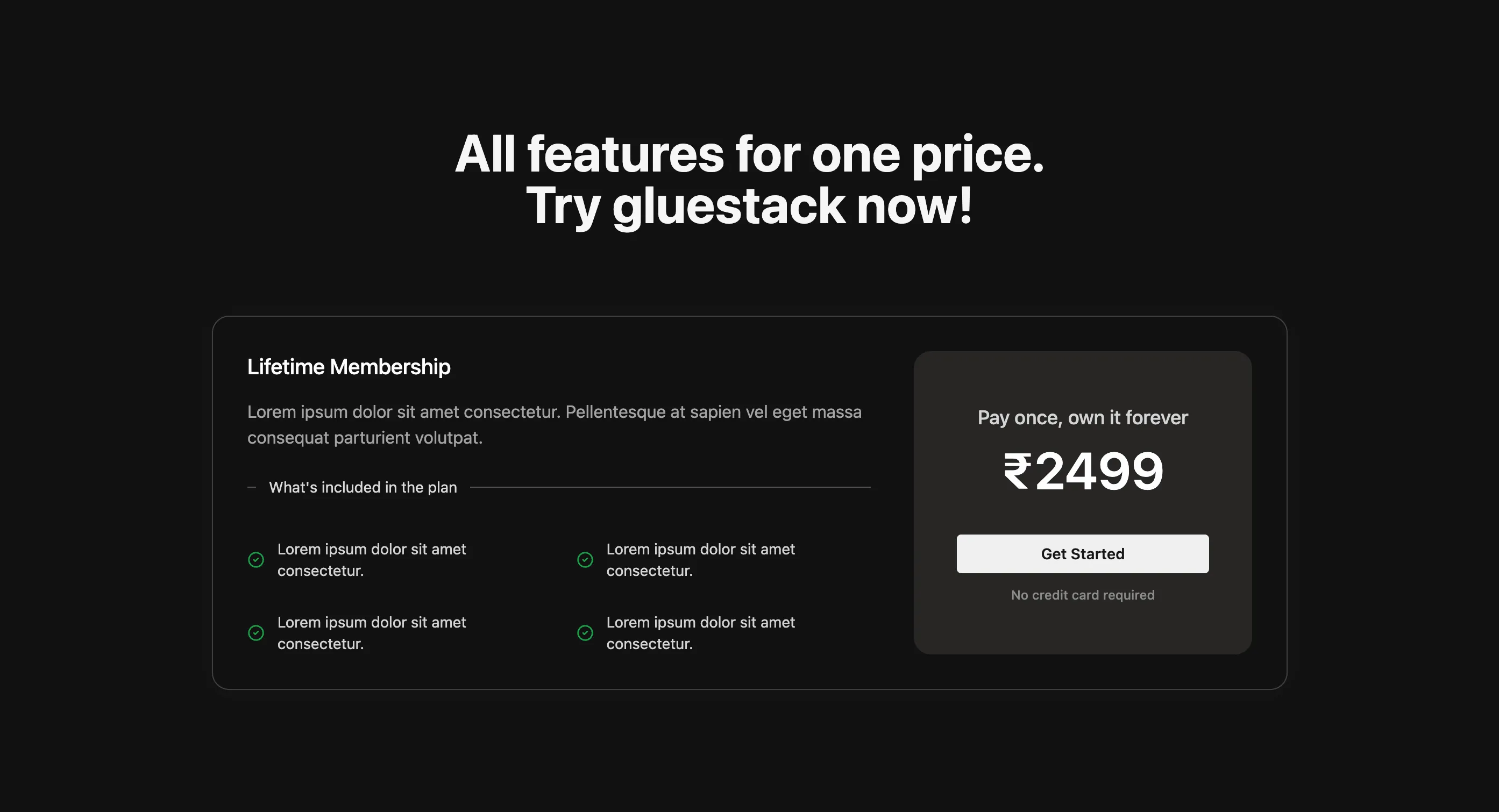
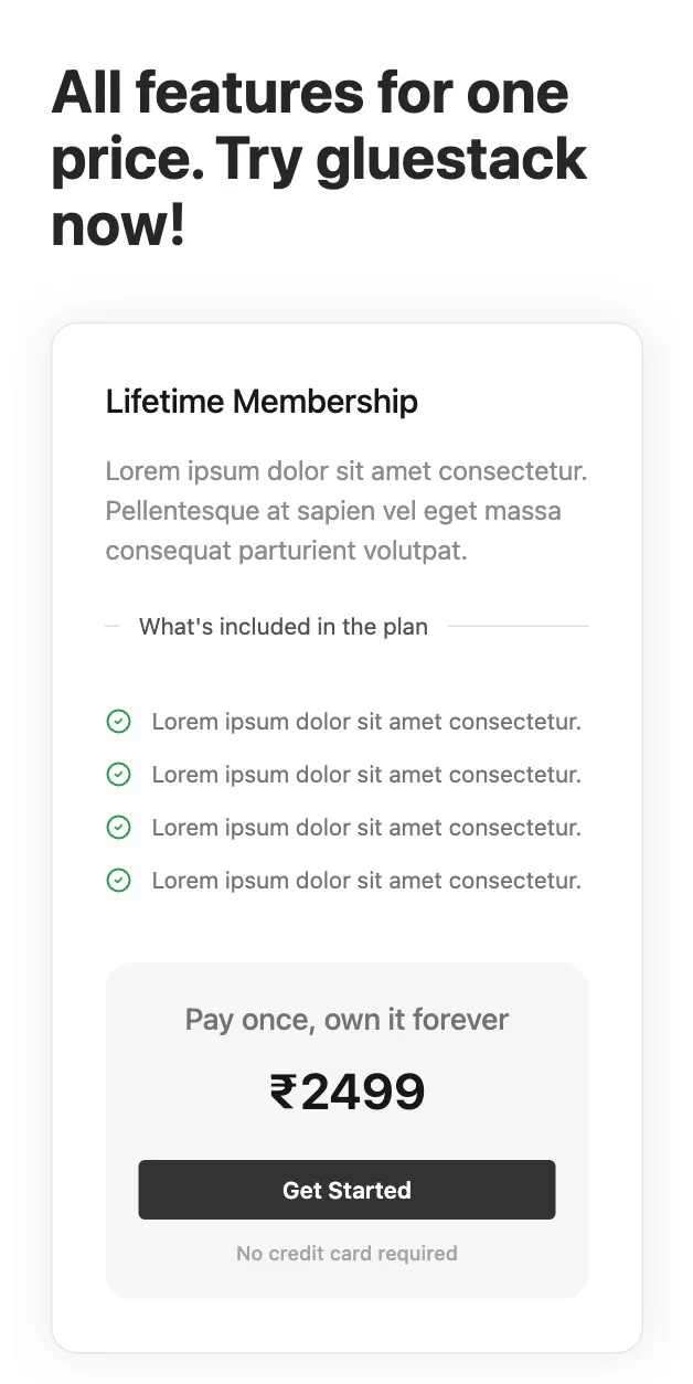
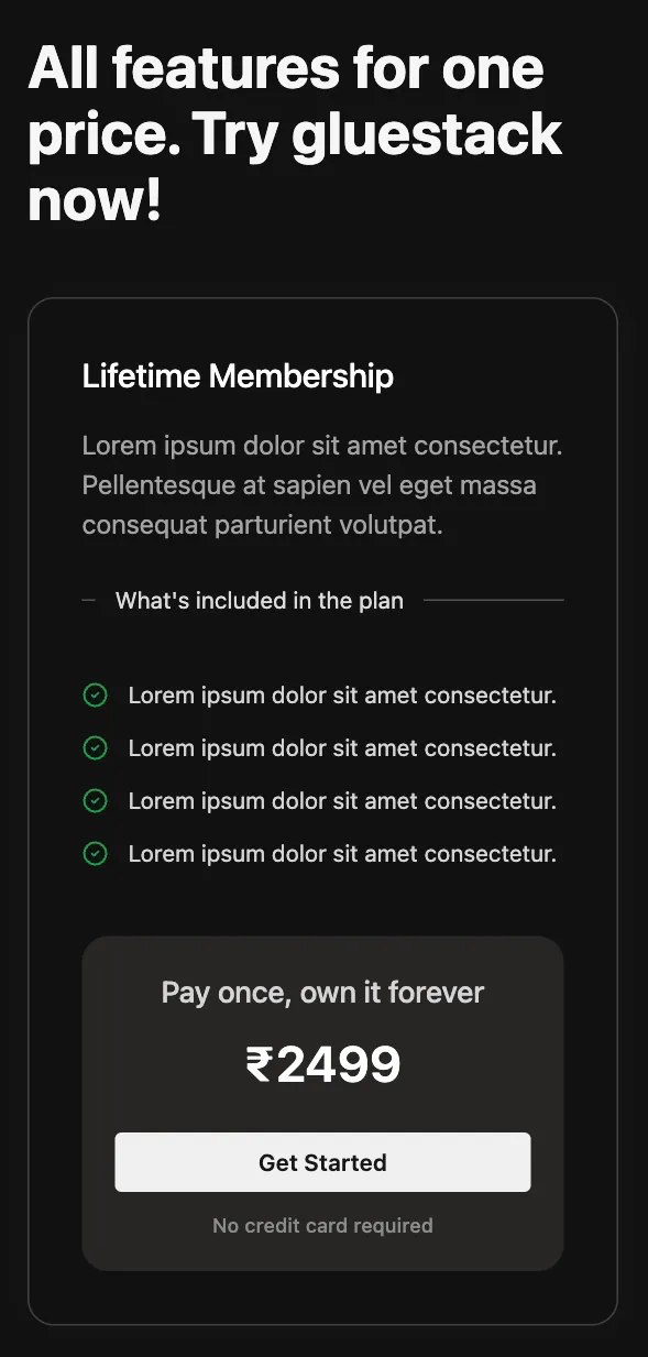
Single Card Pricing Layout
The Single Card Pricing Layout component displays a single card with the pricing information of a plan. It also lists the features and benefits that come with it.
UI Preview
Usage
To use the SingleColumnPricingLayout component, import it and provide it with the necessary data. Here is a basic example:
import React from "react";import { SingleColumnPricingLayout } from "@app-launch-kit/components/custom/pricing/SingleColumnPricingLayout";import data from "@app-launch-kit/utils/constants/lifetimePricingCard";
export const SingleColumnPricingLayoutBasic = () => {  return (    <SingleColumnPricingLayout      data={data}      title="All features for one price. Try gluestack now!"    />  );};